Device Analytics
The Device Analytics page provides comprehensive insights into what devices, browsers, and operating systems your visitors use. This information helps you optimize your website’s design, performance, and compatibility for your actual audience.
Accessing Device Analytics
Navigate to Dashboard > Devices to view your device analytics data.
Charts Section
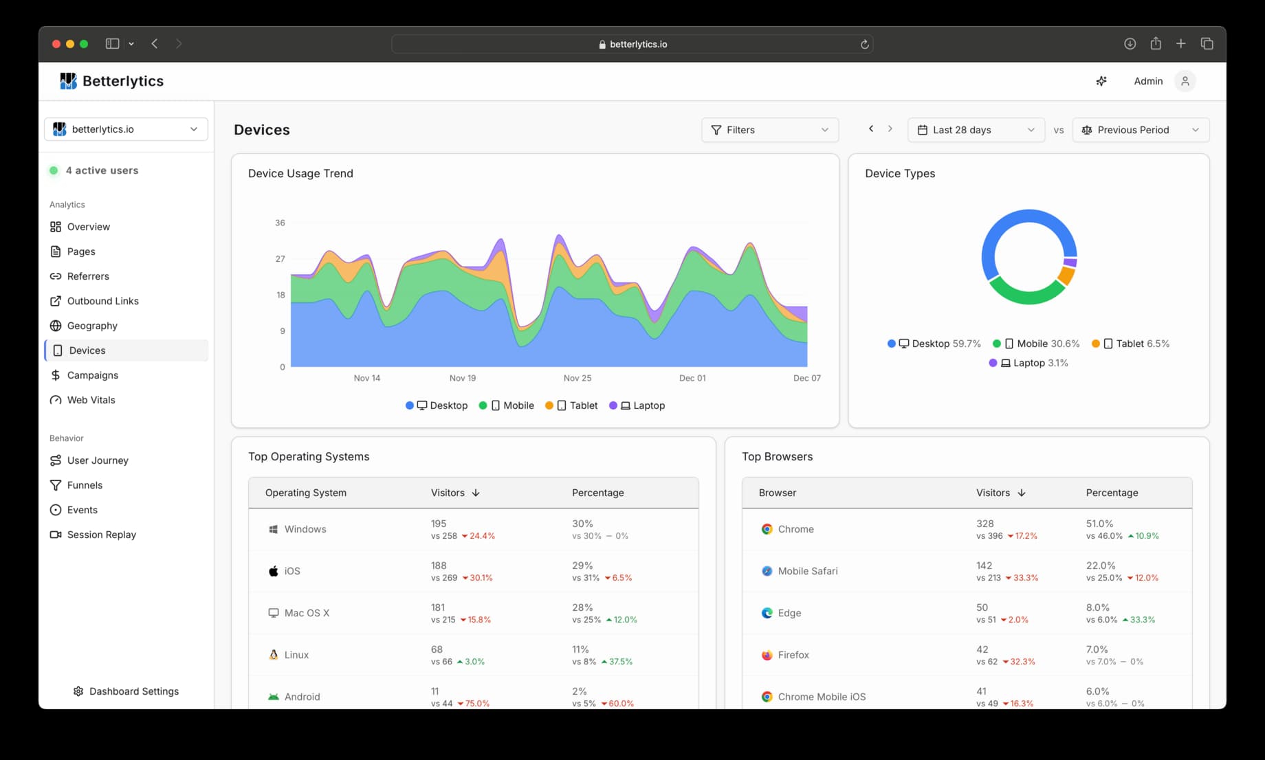
Device Types Distribution
What it shows: A pie chart displaying the breakdown of visitors by device category.
Device Categories:
- Mobile - Smartphones (screen width < 576px)
- Tablet - Tablet devices (576-991px width)
- Laptop - Laptop computers (992-1439px width)
- Desktop - Desktop computers (1440px+ width)
Device Usage Trend
What it shows: A stacked area chart showing how device usage changes over time.
Features:
- Stacked areas represent different device types with distinct colors
- Trends over time help identify seasonal patterns or shifts in user behavior
- Comparison support to see changes from previous periods
Tables Section
Top Operating Systems
What it displays:
- Operating System name
- Visitor count - Number of unique visitors using each OS
- Percentage - Share of total visitors
Top Browsers
What it displays:
- Browser name - The name of the browser the visitor is using
- Visitor count - Number of unique visitors using each browser
- Percentage - Share of total visitors
Interpreting Your Device Data
Design and Development Priorities
High Mobile Usage (>60%)
- Prioritize mobile-first design
- Optimize touch interactions
- Ensure fast loading on slower connections
- Consider Progressive Web App features
High Desktop Usage (>60%)
- Leverage larger screen real estate
- Design for mouse/keyboard interactions
- Consider more complex interfaces
- Focus on desktop browser compatibility
These are not hard rules, and you should always test your website on different devices and browsers to ensure it is working as expected.
Browser Compatibility Strategy
Dominant Browser (>70% single browser)
- Safe to use newer web features supported by that browser
- Can optimize specifically for that browser’s performance
- Still test in other browsers for edge cases
Diverse Browser Mix
- Focus on web standards and cross-browser compatibility
- Test thoroughly across different browsers
- Avoid browser-specific features
- Consider polyfills for newer features
Dashboard Filters
Device analytics respects all dashboard filters:
- Time Range - Compare device usage across different periods
- Query Filters - Segment device data by geography, traffic source, or custom criteria
- Comparison Periods - See how device usage has changed over time
Use Cases by Industry
E-commerce
- Mobile optimization if high mobile usage for checkout flows
- Cross-device breakdown for shopping journey analysis
- Performance optimization for conversion-critical pages
SaaS/Business Apps
- Desktop optimization for complex workflows
- Browser compatibility for business users
- Responsive design for mobile access to dashboards
Content/Media Sites
- Mobile reading experience optimization
- Video compatibility across devices
- Performance optimization for content consumption
Lead Generation
- Form optimization for mobile devices
- Landing page performance across device types
- CTA placement optimized for device-specific interactions
Best Practices
Regular Monitoring
- Check monthly trends - Device usage can shift over time
- Monitor new device types - Identify emerging patterns
- Compare to industry benchmarks - Understand your audience relative to your industry
Performance Optimization
- Prioritize your top devices - Focus optimization efforts where they’ll have the most impact
- Test real devices - Emulators don’t always reflect real performance
- Monitor Core Web Vitals - Different devices have different performance characteristics
Design Decisions
- Mobile-first if mobile-dominant - Start design with smallest screens
- Progressive enhancement - Build up from basic functionality
- Touch-friendly interfaces - Even desktop users may have touch screens
Quick Analysis Questions:
- Does your device distribution match your expectations? - Unexpected patterns may indicate new user segments or technical issues
- Are there any devices with unusually high bounce rates? - This could indicate compatibility or performance issues
- How does device usage correlate with conversions? - Different devices may have different conversion patterns
Important Considerations:
- Device detection is based on screen size - Some tablets may be classified as laptops based on resolution
- Browser data comes from user agent strings - Some privacy tools may affect accuracy
- Operating system detection - May not capture specific versions, just the main OS family
- New devices - Emerging device types may initially be classified as “unknown”
Questions about device analytics? Join our Discord community for help!