Dashboard Overview
Your main dashboard page is the central hub for monitoring your website’s performance. It provides a comprehensive overview of your key metrics through interactive charts and summary tables, giving you immediate insights into visitor behavior and website trends.
Main Dashboard Components
When you first land on your dashboard, you’ll see several key sections organized for maximum insight:
1. Key Metrics Summary Cards
At the top of your dashboard, four interactive metric cards display your most important KPIs:
- Unique Visitors - The number of distinct visitors to your website
- Total Pageviews - Total pages viewed across all sessions
- Bounce Rate - Percentage of sessions with only one page view
- Average Visit Duration - How long visitors typically stay on your site
Interactive Feature: Click any summary card to display that metric in the main chart below. Each card shows a mini sparkline chart and changes the main visualization to focus on your selected metric.
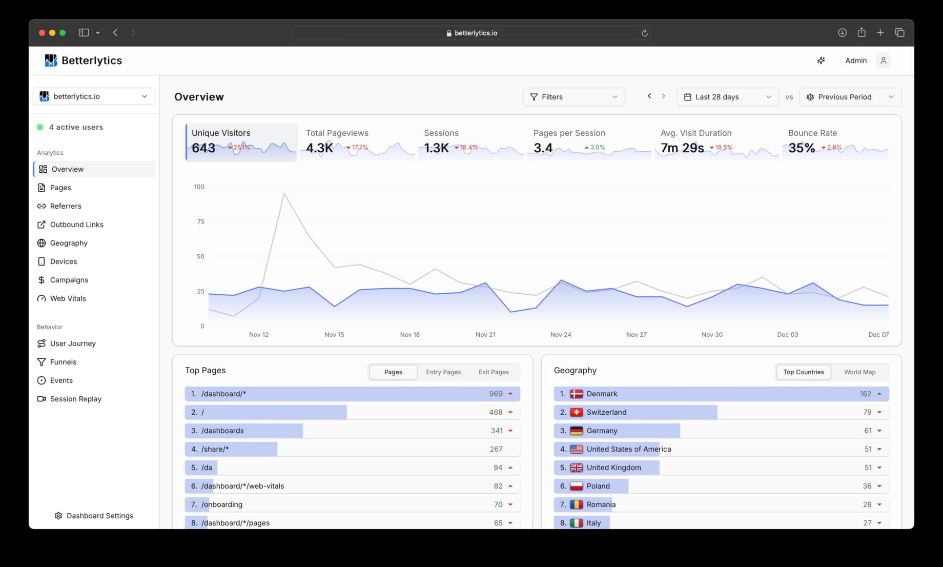
2. Interactive Time-Series Chart
The main chart, shown in the image above, dynamically displays your selected metric over time, with several interactive features:
- Responsive to Summary Cards - Automatically updates when you click different metric cards
- Time Period Comparison - Shows current vs. previous period data with dashed comparison lines
- Hover Details - Detailed tooltips show exact values and percentage changes
- Flexible Time Ranges - Adapts to your selected date range with appropriate granularity
3. Summary Tables Overview
Below the main chart, you’ll find a collection of five summary tables that provide quick insights into different aspects of your website traffic:

Each of the five summary tables (Top Pages, Geography, Devices Breakdown, Traffic Sources, and Events) features its own set of tabs. These tabs allow you to drill down into different aspects of the data within that category. For example, under Top Pages, you can switch between Pages, Entry Pages, and Exit Pages. Use the tabs at the top of each table to explore the specific insights available.
Top Pages
- Pages: Most visited pages ranked by unique visitors
- Entry Pages: Common landing pages where visitors first arrive
- Exit Pages: Pages where visitors most often leave your site
Geography
- Countries: Visitor breakdown by country with exact visitor counts
- World Map: Interactive world map visualization showing global traffic distribution
Devices Breakdown
- Browsers: What browsers your visitors use (Chrome, Firefox, Safari, etc.)
- Devices: Device types (Desktop, Mobile, Tablet)
- Operating Systems: OS distribution (Windows, macOS, iOS, Android, etc.)
Traffic Sources
- Referrers: Specific websites that send traffic to you
- Sources: Categorized traffic sources (Google, Facebook, direct, etc.)
- Channels: Traffic channels (Organic Search, Social Media, Direct, etc.)
Events
- Custom Events: Your custom tracked events (button clicks, form submissions, etc.), ranked by number of occurrences
- Global Properties: Key-value metadata attached to all events (e.g. plan, role, app version), ranked by unique visitors. See Global Properties for setup instructions.
Visual Design: Each table uses progress bars to show relative values at a glance, making it easy to spot your top-performing pages, countries, or traffic sources without looking at exact numbers. Hover over the progress bars to see the exact numbers and percentage of total occurrences.
How to Use Your Dashboard Overview
- Start with the Summary Cards - Get an immediate sense of your website’s performance
- Select Your Focus Metric - Click any card to dive deeper into that specific metric
- Analyze the Time Trends - Use the main chart to spot patterns and changes over time
- Scan the Summary Tables - Quickly identify top performers and areas for optimization
- Dive Deeper - Click on any section title or use the sidebar to explore detailed analytics
Dashboard Filters
All data on your overview page respects your dashboard filters:
- Time Range Selection - Choose from presets or custom date ranges
- Comparison Periods - Enable side-by-side period comparisons
- Query Filters - Apply specific filters to focus on particular segments
Exploring Individual Sections
While your overview page provides a comprehensive snapshot, each data category has its own dedicated section with much more detailed analysis:
Referrers
Traffic sources, search engines, social media, and direct visit analysis.
Geography
Country-level visitor breakdown with interactive world map.
Campaigns
UTM campaign tracking and marketing attribution across all traffic sources.
User Journey
Sankey diagrams showing how visitors navigate through your site.
Devices
Browser, OS, and device type breakdown with usage trends.
Events
Custom event tracking with real-time event log and property analysis.
Error Tracking
Client-side JavaScript error capture with stack traces and session replay links.
Funnels
Multi-step conversion funnels with drop-off analysis.
Outbound Links
External link click tracking with destination and trend data.
Web Vitals
Core Web Vitals monitoring: LCP, INP, CLS, and TTFB.
Session Replay
Replay visitor sessions with event timelines and privacy masking.
Uptime Monitoring
Website uptime and SSL certificate monitoring with alerts.
Email Reports
Scheduled weekly or monthly analytics summaries delivered to your inbox.
Notifications
Slack, Discord, Teams, and webhook alerts for monitoring and uptime events.
MCP Server
Query your analytics via AI assistants using the built-in MCP integration.
Filtering
Segment data by any dimension with multi-filter support.
Metrics Glossary
Definitions and calculation methods for all dashboard metrics.